Published by the Students of Johns Hopkins since 1896
July 2, 2026July 2, 2026 | Published by the Students of Johns Hopkins since 1896
figure 1.png
·
COURTESY OF GENEVIEVE BRIAND
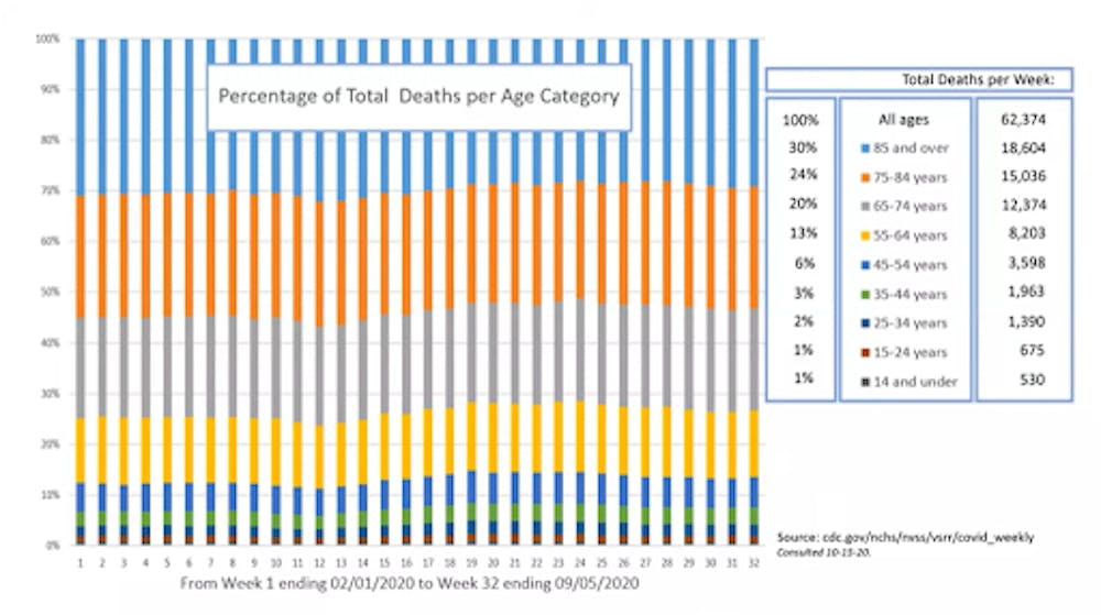
Figure 1.This graph shows deaths in each age group listed in the legend on the right as percentages of total deaths by all causes. Each column represents one week of data from Week 1 ending Feb 1 to Week 32 ending Sept 5.


COURTESY OF GENEVIEVE BRIAND
Figure 1.This graph shows deaths in each age group listed in the legend on the right as percentages of total deaths by all causes. Each column represents one week of data from Week 1 ending Feb 1 to Week 32 ending Sept 5.