With campaign season come campaign materials, the brightly colored manifestations of our candidates that boil down the issues to a pithy phrase or unflattering picture of an opponent. We’ve all seen the lawn signs, bumper stickers, T-shirts and campaign buttons, but what have their hues, patterns and slogans been doing in the backs of our minds as we consider the major issues of the day?
The answer to that question is unfortunately never going to be straightforward. Researchers haven’t yet nailed down whether red or blue is more conducive to merchandising and persuasion. We don’t know whether darker colors have more authority than lighter colors, and no one has come up with a study proving that bubble letters mean more votes than block letters.
Let’s face it, if graphic design or social science had come up with definitive answers for these questions, every piece of campaign memorabilia would look exactly the same.
Even so, we do know that the aesthetics behind campaigns (both political and marketing) do matter and can influence voters and buyers. One of the main reasons for the uncertainty about what works best is that much of the influence depends largely on the personal preferences of the viewers, especially where color is concerned. People who prefer green to purple tend to prefer brands marketed in green over brands marketed in purple; This is far from surprising news.
Still, it doesn’t mean that there are no patterns whatsoever. Even within this color-preference metric, there can be group biases: Women, according to Joe Hallock’s “Colour Assignment” study, tend to show a consistently stronger preference for purple than men do.
People in general tend to show a strong preference for blue, which explains the swathe of all shades of azure, indigo and sapphire across both of the campaign trails.
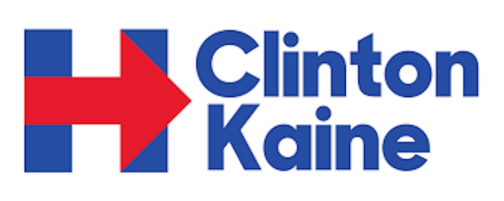
Even with this similarity, there are some major differences between the merchandise. The most common Clinton-Kaine print has the two names in the same size font in white on a pure blue background.
Clinton’s name takes up more space than Kaine’s purely because it has more letters, and to the left of their names is a large “H” with an arrow running through it in place of the crossbar.
The arrow, which points toward the right, might raise some questions. While our symbolic political shorthands should perhaps recommend that Clinton’s arrow point to the left, we do read from right to left, and number lines are arranged with numbers increasing to the right, so the arrow reads as pointing forward.
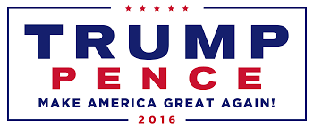
The standard Trump-Pence sign, on the other hand, is arranged on a white background with Trump’s name centered above Pence’s in a larger font (35 percent larger according to TIME Magazine).
Both names are in capital letters with Trump’s in navy and Pence’s in red. Under the two names is the slogan “Make America great again!” also in capitals.
Both signs are fairly standard campaign fare. The Clinton-Kaine design, with it’s lower case letters and normal spacing, perhaps prioritizes ease of reading more than the Trump-Pence sign. Otherwise, they both communicate the essential information. Clinton-Kaine will move you forward with the arrow, and Trump-Pence harkens back to the “greatness” of America’s history.
The path to the current iteration of Trump’s sign had an initial road bump, however, directly after Pence was announced as the running mate. The first design lasted only a few days and featured a stylized U.S. flag above the candidates’ names. The blue stars-and-stripes field of the flag consisted of a “T” and a “P” with the stem of the T going through the counter of the P. This design immediately sparked a flurry of Twitter activity including from former Michigan Rep. Democrat John Dingell who tweeted, “What is the T doing to that P?” (to say nothing of the unfortunate “toilet paper” abbreviation).
The quick switch from the old logo to the new proves that the designs matter, but what can we glean from looking at the overall themes of each candidate’s marketing?
The slogan most often associated with Hillary’s campaign is “I’m with Her,” but scrolling through her web store, other phrases recur as well. There’s “Stronger Together,” “Forward, together,” “Love trumps hate,” “#HillYes,” “Fight like Hill” and “She can do it!” with an image of Rosie the Riveter. On the Trump campaign site, there is the classic “Make America great again!” alongside “HRC Liar. Liar. Pantsuit on Fire!,” “Grow business shrink government,” “I am a deplorable,” “Feeling Berned? Vote for Trump” and “I am your voice.”
What does all this tell you? Well, certainly not all you need to know, but digging deeper into the design of campaign materials can provide insights about the kind of campaign the candidates are running and who they’re trying to appeal to most.