This is a historic year for the twelve nations competing in hockey at the Milano-Cortina Olympics. These twenty days in February are a welcome break from the NHL season. Competition started on Feb. 11, and ends on Sunday, Feb. 22. While I enjoy watching my city play, there’s nothing like routing for your country to take gold. While I could do a detailed game-by-game breakdown, these jerseys caught my eye and they deserve their own spotlight. To preface, this is just my take almost purely based on aesthetics.
12. France
These jerseys remind me of what happens when I try to design a shirt for a club. A random font gets chosen that looks close enough to something that’s close enough to good. Then they threw on the lines to fill up some extra space. What about a fancy Eiffel Tower? Or if they still want to keep it simple, just the word France without the simple lines that somehow make something simple something heinous.
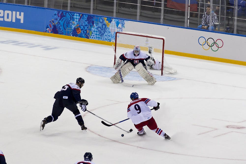
11. Czechia
I think the color block is what’s sending me. It was a brilliant idea, yet the execution was poor. The back of the red home jersey works, but the white one confuses me. Something about the little pop of yellow in the really large crest when there are already so many colors.
10. Italy
The sleeves feel like an afterthought by someone trying to spice up artwork, but looking at the piece without their glasses on. To be fair, they look super sick on the dark blue home jersey, but when the little squares are in white atop the light blue sleeves of the away jersey, they dominate in a harsh way.
9. Latvia
Thorn: the corners. Rose: the maroon and the coat of arms. Bud: the cool geometric lines at the bottom and the font.
8. Denmark
Denmark, were you trying to design what Finland created? Maybe it’s the bright red accented only by plain white and black. Maybe it’s the weird zig zags through the middle stripe, or the blue lion in the center that they decided to make cherry red. Designers, if you’re reading this, can you make the middle stripe wider so the lion doesn’t seem so out of place?
7. USA
For the first time since 2014, the NHL Player’s Association came to an agreement with the league to address past issues and allow players to compete. The New York Rangers can now go compete in the world’s biggest stage, but did they take too much of the team with them? That being said, the diagonal letters are a nice change to the typical template.
6. Sweden
This design is the Swedish Tre Konor, or three crowns, and it continues to be a timeless success. I fear the bright yellow is just a little startling. I would add a white outline to the stripes and the crowns, then maybe my eyes wouldn’t be as jarred by the transitions.
5. Germany
The black jersey made me rate this so highly. Black, gold, red, black, gold again but this time with a fancy pattern radiating off of the neckline. The crest popping out in the center is a fearsome addition, yet I wonder if the colors in the gold jersey’s crest should have been reversed.
4. Switzerland
This is a seamless canvas, if a little boring. Everyone knows Switzerland from their iconic flag. These jerseys took that simplicity and ran with it, skating miles to add the black outline to the shield where the cross sits and the double stripe across the center.
3. Canada
Rating this jersey so high may be a hot take, but the maple leaf dominating is a statement in the best possible way. Especially on the black jersey, where the leaf is outlined in red, am I adamant that no writing of “Canada” was needed. But the corners.
2. Slovakia
While the color scheme is very similar to many other teams, the design sets these jerseys apart. They got the color block correct, mostly due to the mountains shaded into the dark blue base color. Additionally, the coat of arms matches the progression of elements on the blue jersey but doesn’t feel like a forced copy. I do wonder what this would have looked like if the mountains were to continue into the red stripe.
1. Finland
Wow. On first glance, it’s a light blue band atop a darker blue background, but the shades mesh perfectly. Upon further inspection, the epic gold lion is hoisting his sword while facing a combination of triangles, different in color or texture. The design is seamless, attracts the eye into the dark blue night and reflects the gaze off the glimmering lion.