I love change as much as the next person, but sometimes I have to put my foot down and say, “Enough is enough!” I need consistency in this constantly evolving world. Technology specifically can become obsolete within months due to the accelerating innovation in the tech industry. But as a 20-year-old, I crave stability.
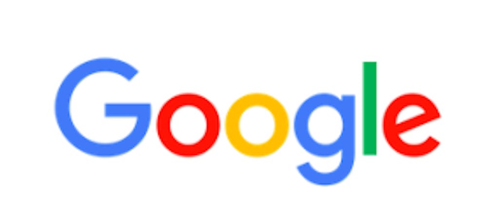
So why, I ask, did Google have to change their logo this past week? The elegance of serif font has been eliminated in favor of the far less regal sans-serif. Perhaps in the same category of Comic Sans, sans-serif lacks the grace and refinement of a respectable font. When I think of Google, I think of a company that I trust. I put my good faith (and final drafts) in Drive, I network with Gmail, and I plan my every waking second on Google Calendar. Can Google really expect me to confidently place the finer details of my life in the hands of a company whose logo is reminiscent of refrigerator magnets?
All jokes aside, since the founding of Google in 1998 the multinational technology enterprise has evolved from a simple search engine to a multi-billion-dollar conglomerate with numerous subsidiaries managed by newly proposed public holding company Alphabet Inc. Their growth in the technology industry only leads me to believe that their change in logo is an attempt to reconnect with users by reverting to a child-like innocence. The old Google logo, in all of its serif glory, is an iconic beacon of light to the Internet-crazed Generation Y. While yes, the new logo still maintains the myriad of cheerful colors, something feels wrong about losing the classic and dignified tendrils and ornamentation that once adorned the six-letter testimony of innovation.
This is not the first time that Google has changed its logo either. Since 1998, there have been six variations of the Google logo, including this most recent change. This is the most dramatic alteration with the discarding of the serif. Visually, the second “g” is the largest victim to the new font. In the grand scheme of things, this change in logo is not significant enough to make me stop using Google. But the adornment of the red, yellow, green and blue that decorate the Google Search tabs clustered around the top of my glowing screen remind me that change is on the horizon and that it may be change for which I am not prepared for.
I am sure that the executives and directors at Google did not make this decision at the spur of a moment, but rather performed A/B tests and gathered significant research in support of their selection. Visually aligning themselves with the new public holding company mentioned earlier, the Google logo is entering a new era that coincides with the progress of the company. While we, as the consumer, may not be completely on board with the change in logo, it seems fitting that our daily lives be disturbed by such a minor, yet significant, alteration. It opens my eyes to how comfortable I had become with the familiar. At the current rate of innovation and advancement, I better become accustomed to change for my own benefit as more change is yet to come.
Google’s mission is “To organize the world’s information and make it universally accessible and useful.” By connecting the new generation of thinkers and creators under a cleaner logo, Google is more than an iconic brand — it is a platform for advancing technology and global modernization. Much like IBM or General Electric, it has built a reputation upon greatness and merit. With the company valued at nearly $365 billion and ranked only below Apple and Microsoft in Forbes’ World’s Most Valuable Brands, I trust that Google’s change in logo indicates new breakthroughs and developments that are predicted for the near future. I truly hope that their change in logo is not in vain, but that it is a cognisant effort that foreshadows a new era of distinction for the technology industry.