The News-Letter published “A closer look at U.S. deaths due to COVID-19” on Nov. 22. The article was written to recap a webinar held on Nov. 13, where Genevieve Briand, the assistant director for the Master’s in Applied Economics program at Hopkins, presented data she had downloaded from the Centers for Disease Control and Prevention (CDC) and plotted independently. The analysis presented in the webinar was not a published, peer-reviewed study; it contradicted data published by Hopkins, the World Health Organization (WHO) and the CDC.
The Editors-in-Chief took down the article on Nov. 26 because the piece was being used to spread dangerous misinformation. The following day, they published an Editor’s Note and an accompanying PDF link to the original article to explain the inaccuracies of Briand’s research. On Dec. 3, the Editorial Board published an editorial regarding the decision to retract the article.
We, the editors of the Science & Technology section, note that the original article included figures with unreadable legends and axes, as well as incomplete explanations of the methods used. In addition, the article failed to include the voices of public health professionals.
In this article, we contextualize Briand’s findings with the perspectives of epidemiologists and biostatisticians.
Regarding the statements about excess deaths due to COVID-19
In the concluding statements of her talk, Briand commented on the nature of excess deaths due to COVID-19.
“All of this points to no evidence that COVID-19 created any excess deaths. Total death numbers are not above normal death numbers. We found no evidence to the contrary,” Briand said.
However, Emily Gurley, an associate scientist in the Department of Epidemiology at the School of Public Health, noted in an email to The News-Letter that because Briand’s presentation does not specifically examine excess deaths, her conclusions are flawed.
“Researchers (from both within the CDC and outside) have already analyzed data on vital statistics to show that >300,000 deaths have occurred in 2020 than occurred during the same time in other recent years (after accounting for changes in the size and age of the population),” Gurley wrote.
Sourya Shrestha, a research associate in the Department of Epidemiology at the School of Public Health, elaborated on the standard method used to calculate excess deaths. He asserted that comparing death counts week-to-week as Briand did fails to account for two important considerations: random fluctuations and seasonal trends.
“A more robust way [to calculate excess deaths] is to construct a baseline of expected deaths using trends from past data and compare that to the observed deaths,” he said in an interview with The News-Letter.
As Shrestha described, in its calculation of excess deaths the CDC first sets a threshold of expected deaths based on historical trends from 2013 to the present. It then compares counts of deaths in 2020 to the average expected count. The difference between the expected count and the observed number of deaths determines the numbers of excess deaths.
The Morbidity and Mortality Weekly Report, published on Oct. 23, reported that 299,028 excess deaths occurred from Jan. 26 to Oct. 3. About two-thirds of those deaths were attributed to COVID-19. Other peer-reviewed papers have reported similar findings.
Gurley noted that the data presented in the webinar failed to address these statistics and did not demonstrate that officially reported numbers were wrong.
“There are no data in this presentation that show that previous reports on the magnitude of deaths from COVID-19 are incorrect,” Gurley wrote.
Regarding the toll of COVID-19 on death in the U.S.
Briand opened the webinar by asking the audience to compare death counts by all causes to COVID-19 death counts from March 15 to Sept. 19.
“The all deaths count was 1.7 million, and the U.S. COVID-19 deaths count was 200,000 deaths in that time period, which means we have 1.5 million other deaths, deaths due to other causes. I think it is important to put the COVID numbers in perspective,” she said.
Shrestha appreciated Briand’s point but emphasized that deaths due to COVID-19 still represent a worrying fraction of all deaths in the United States.
“I respect that she attempted to put COVID deaths in the perspective of deaths due to other causes. That is important, and that point has to be made. But that doesn’t mean we need to undermine what is actually happening due to COVID,” he said. “The number of deaths that we have seen are concerning.”
Briand described her reasoning for presenting those numbers, stating that the toll of the pandemic should be assessed in light of deaths due to other causes in the United States.
“We are all familiar with COVID-19 death numbers but not necessarily with U.S. all death numbers,” she said. “How can we say that COVID death numbers are concerning if we don’t compare them with total death numbers, numbers that we should expect every year?”
Justin Lessler, an associate professor in the Department of Epidemiology at the School of Public Health, argued that the percentage of deaths due to COVID-19 is alarming in part because it is a new disease. He co-wrote an op-ed for USA Today entitled “Why the 'COVID-19 killed only 6%' argument is wrong,” in which he argued against the idea that comorbidities invalidate deaths due to COVID-19.
“COVID-19 accounts for around 10% of deaths that occurred [from March 15 to Sept. 19]. This is massive, especially when you think about the fact that the other two leading causes, cancer and heart disease, were things people would have coming into this time, while COVID-19 was not,” he wrote in a statement to The News-Letter.
Regarding the age distribution of COVID-19 deaths
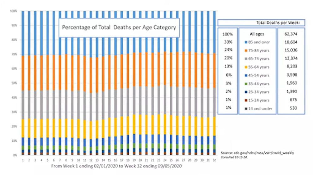
In the webinar, Briand displayed a 100% stacked column graph (Figure One) which showed the age distribution of U.S. deaths from February to early September.
Briand explained that to create Figure One, she downloaded provisional, weekly death counts by demographic and geographic characteristics from the CDC website. Provisional death counts consider the information found on death certificates, which is coded by the National Center for Health Statistics (NCHS). The weekly death counts are continuously updated as death certificates are received by NCHS.
She then created the graph to compare the age distribution of deaths from Feb. 1 to Sept. 5. (Note: The data used in the creation of the graph was consulted Oct. 15. Since the webinar, the data have been updated. According to the CDC website, the last update was made on Dec. 9.)
Briand stated that her primary point of interest in the graph was the seemingly unchanged age distribution of deaths of older people in weeks 11, 12 and 13.
“We have been told that COVID-19 has been taking a toll specifically on older people, so I was expecting that percentage of people to go up during the weeks of peak COVID-19 deaths, which are weeks 11 to 13,” she said.
However, Gurley did not expect a pronounced shift in the age distribution of U.S. deaths during the pandemic for two reasons.
“[Figure One] shows the age distribution of people who have died in 2020, which has not shifted dramatically over the course of the pandemic. This is expected, for a few reasons: 1) most deaths are not COVID-19 related, and the age distribution of non-COVID-19 related deaths remains constant over time, and 2) the ages of people at highest risk for death from COVID-19 are similar to the ages at highest risk for other causes,” she wrote.
While a dramatic shift in age distribution is not expected, Gurley added that in April, which is represented by weeks 10-14 in Figure One, the oldest age groups do represent slightly higher percentages of weekly deaths in the United States.
“There is a slight shift in increasing mortality among the oldest age groups during the weeks when COVID-19 deaths peaked in April — again consistent with the spike of excess deaths seen during that month,” she wrote.
According to the CDC, “Excess deaths reached their highest points to date during the weeks ending April 11 (40.4% excess) and August 8, 2020 (23.5% excess).”
During the recap of the webinar, Briand stated her hypothesis about the age distribution of deaths during the COVID-19 pandemic.
“The reason that we have a higher number of reported COVID-19 deaths among older individuals than younger individuals is simply because every day in the U.S., older individuals die in higher numbers than younger individuals,” she said. “The data don’t show older individuals are dying in higher proportions to total deaths than usual.”
However, Lessler argued that Figure One clearly demonstrates that the mortality of all age groups, not only older age groups, increased amid the pandemic. Lessler also pointed out that age is the strongest predictor for all causes of mortality, except for deaths due to accidents, drug use or suicide. Like Gurley, he stated that the relative death rate due to COVID-19 is similar to other causes of mortality.
“I see that the proportion [in Figure One] has not changed as evidence that we should not be seeing COVID-19 as a disease of just the very old because, in terms of relative risk of death, it is impacting all ages (or at least all adults) fairly equally... just what that raw number is, is quite different for each age,” he wrote. “If anything, I think [Figure One] is just a stark illustration that COVID-19 raises mortality risk in all age groups.”
Lessler added that analyzing the age distribution of total deaths in the U.S. pre-pandemic and during the pandemic, as Briand did, does not indicate the severity of the pandemic’s toll. Weekly excess deaths, which have been high during the pandemic, are the best indicator.
“While the ratios have not changed much, total deaths have increased substantially from previous years,” Lessler wrote. “[If] you can't explain the excess total mortality, your argument does not hold water.”
Regarding the seasonality of deaths
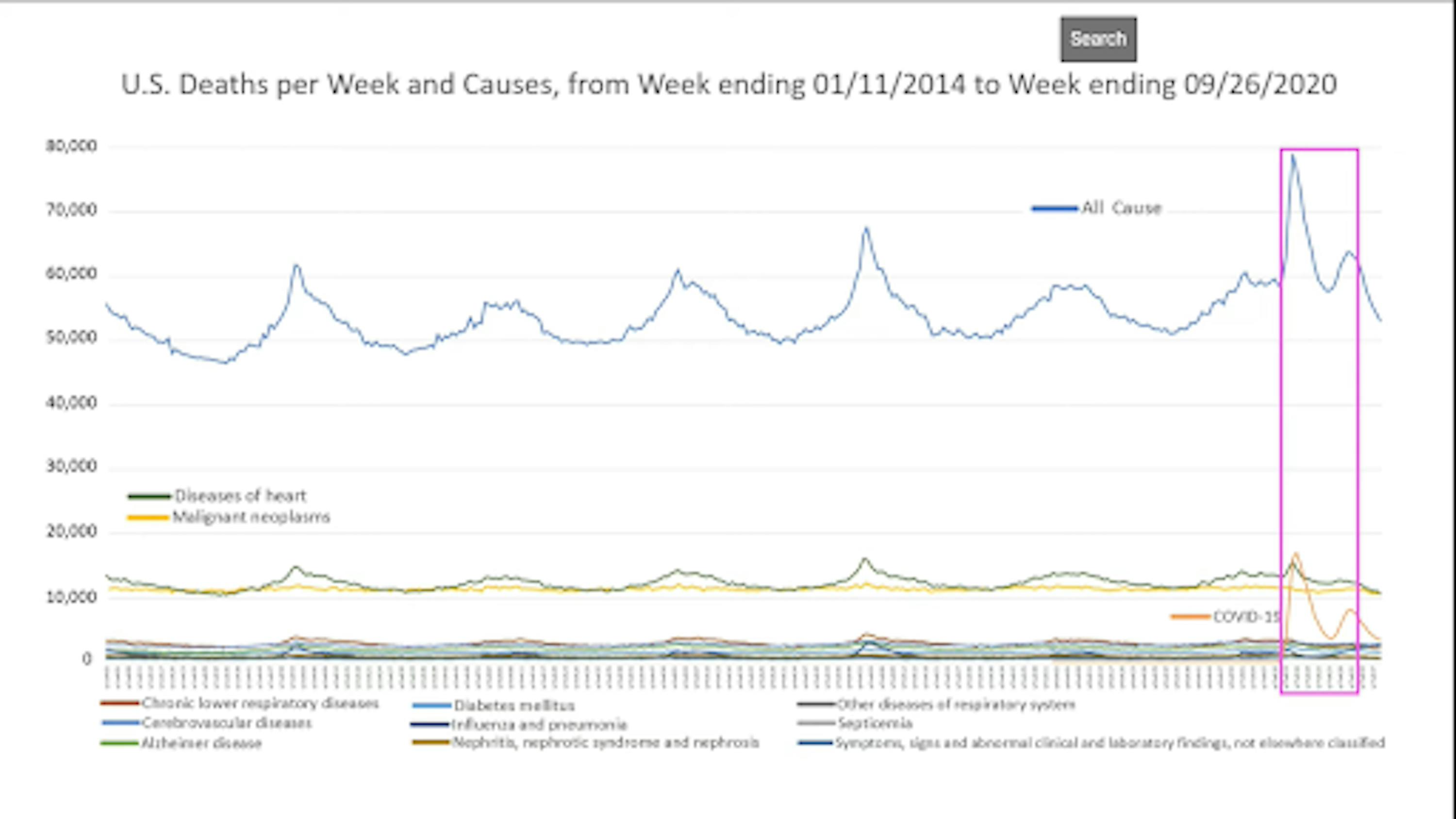
COURTESY OF GENEVIEVE BRIAND
Figure 2.This graph depicts weekly death counts by all causes (blue line) and select causes (color coding explained in the legend). The y-axis represents the number of deaths. Within the pink box, the x-axis begins with ‘yr7wk13’ and ends with ‘yr7wk31’ (as can be seen in the webinar), corresponding to the time period from the last week of March 2020 to the last week of July 2020.

COURTESY OF GENEVIEVE BRIAND
Figure 3.This graph is a zoomed-in view of Figure 2, reflected by the change in scale of the y-axis. The graph in the pink box is a cut out of a narrower time period. Within the pink box, the x-axis begins with ‘yr4wk46’ and ends with ‘yr5wk13’’ (as can be seen in the webinar), corresponding to a time period from December 2017 to the last week of March 2018.

COURTESY OF GENEVIEVE BRIAND
Figure 4.This graph is a zoomed-in view of Figure 2, reflected by the change in scale of the y-axis. The graph in the pink box is a cut out of a narrower time period. Within the pink box, the x-axis begins with ‘yr7wk13’ and ends with ‘yr7wk31’ (as can be seen in the webinar), corresponding to the time period from the last week of March 2020 to the last week of July 2020.
In the webinar, Briand stated that Figure Two was made by downloading weekly counts of deaths by state and select causes from 2014-2018 and 2019-2020. (Note that the talk was given on Nov. 13. The last update of this provisional data was made on Dec. 9.)
Briand reduced the scale of the y-axis of Figure Two in order to better observe the trends at the bottom of the graph. She then focused on two time periods in 2018 and 2020. The first, in Figure Three, reflects data from December 2017 to March 2018, and the second, shown in Figure Four, reflects data from March 2020 to July 2020.
Briand then compared the time periods highlighted in Figure Three and Figure Four and offered her assessment of them.
“In 2017/18, corresponding to the spike of total death, we have corresponding spikes in all causes of death,” she said. “In 2020, we not only have a lower than expected increase in heart attack rate but also a decrease in all other causes of death.”
Gurley noted that the assessment in the webinar did not compare the same months in 2018 and 2020, leading to a flawed interpretation. Comparing winter months (Figure Three) to spring months (Figure Four), Gurley explained, does not account for seasonal variations; for instance, mortality due to most causes, including heart disease, declines in the spring.
“She compares specific cause of death data from 2018 to 2020, but instead of comparing the same months in 2018 to 2020, she compares the time period where total mortality peaked each year,” she wrote. “In doing so, the presenter neglects the fact that COVID-19 deaths peaked in the spring, even though the usual seasonal patterns for other causes of death did not change.”
Lessler added that 2018 was a year with excess mortality, as echoed by the CDC, and noted flaws in focusing on only the peak in mortality of that year.
“2018 was a bad flu year, so she is comparing with a year that we already had some excess mortality. 2020 peaks in deaths are far higher than pretty much every other year,” he wrote. “Also, she makes a logical error in focusing only on the [2018 peak]. If you look at the CDC site you will notice [deaths in] 2018 exceeds the seasonally adjusted average for only 6 weeks, but [deaths in] 2020 exceeds the seasonal average for every week since March 28, 2020.”
In an email to The News-Letter, Scott Zeger, a professor whose primary affiliation is with the Biostatistics Department at the School of Public Health, responded to the hypotheses made by Briand about these data, first writing generally about Briand’s work.
“Dr. Briand’s course materials and presentation style are admirable. She covers key details necessary for students to access and display the CDC mortality data,” he wrote. “Her exploratory graphics and iterative approach to analysis are valuable for the students.”
However, Zeger offered a different hypothesis he believed more likely explains the features Briand questioned.
“Based upon her graphical displays, Dr. Briand hypothesizes that non-COVID causes of death may have been incorrectly attributed as COVID deaths. But, her hypothesis is not as consistent with the observed data as the simpler alternative below,” he wrote. “Recall, the scientific method does not prove a hypothesis to be true. It uses data to support some hypotheses relative to others.”
Zeger acknowledged the pattern of deaths in Briand’s presentation but said that the reduction in deaths viewed in the spring was also a part of this seasonal pattern and not likely a sign of misattribution.
“Dr. Briand correctly points out the winter peaks in most causes of mortality. These are associated with respiratory infections that exacerbate many chronic conditions,” he wrote. “In the winter of 2019-2020, there is clear evidence of the expected seasonal peak that was then swamped by the COVID rise in the spring. The trough in non-COVID causes that Dr. Briand notes that spring is not a mis-attribution of non-COVID deaths to COVID. It is the natural spring abatement of the winter mortality rise that happens every year.”
On the statement about misclassification of COVID-19 deaths

COURTESY OF GENEVIEVE BRIAND
Figure 5.For the weeks ending April 11, April 18 and April 25, this table presents the change in the number of U.S. deaths due to select causes compared to the week prior.
The grey row is the total decrease in the number of deaths due to select causes compared to the previous week, calculated by combining the negative numbers in each column. The pink row shows the difference between deaths due to COVID-19 and deaths due to heart diseases.
During the webinar, Briand explained why she selected the weeks displayed in the table.
“Those are the three weeks where we had the highest number of COVID-19 deaths,” she said. “For those three weeks, the records show COVID-19 death numbers to be higher than the heart attacks death numbers.”
In the selected weeks in April, the CDC shows a peak in COVID-19 deaths in the graph at the bottom of the Weekly Updates by Select Demographic and Geographic Characteristics page.
Briand further identified the numbers in Figure Four she was interested in. She pointed out that in the column titled “Week Ending April 18,” there are 2,540 fewer deaths due to select causes and 2,561 more deaths due to COVID-19 compared to the previous week. In the question and answer session following the webinar, she used this data to speak about the nature of death classification.
“If [the COVID-19 death toll] was not misleading at all, what we should have observed is an increased number of heart attacks and COVID-19 numbers. But a decreased number of heart attacks and all the other death causes that we saw doesn’t give us a choice but to point to some misclassification — not all of them, but some reclassification of death [causes],” Briand said.
Shrestha described Briand’s conclusion as incorrect, explaining that it is a coincidence that there is a slight resemblance between the seasonal reductions in deaths due to other causes and the increase in deaths due to COVID-19 in weeks ending April 11, April 18 and April 25 compared to the previous week. This does not provide evidence, he said, that deaths due to COVID-19 are misclassified.
“The concerning part is picking a week or two during a specific part of the calendar year and looking at week-to-week changes. E.g., deaths related to flu and health conditions are seasonally in decline around mid-April. The fact that it coincides with an increase in COVID cannot be taken as evidence for COVID leading to reduced deaths due to other causes. There is a standard way of calculating excess deaths,” he said.
The calculation of excess deaths is explained in the section Regarding the statements about excess deaths due to COVID-19.
In her email to The News-Letter, Gurley echoed Shrestha’s statements.
“If we compare the trend in deaths from heart disease in April of 2020 to April of previous years, we’ll find a very similar pattern — namely, that deaths from heart disease have fallen, by about the same amount, in April every year,” Gurley wrote. “This analysis does not provide any evidence for possible misclassification of deaths nor changes in usual trends of deaths from heart disease during the pandemic.”
Gurley explained that the method used to classify deaths is a standardized process, making the misclassifications that Briand suggests unlikely.
“The U.S. has a vital registration system whereby all deaths are reviewed and classified by cause using the International Classification of Disease (ICD) system (we now use ICD-10),” she wrote. “These data are routinely collated and made publicly available on the CDC website.”
According to the CDC, deaths are coded in accordance with the 10th revision of the International Classification of Diseases (ICD-10). The WHO has established two main codes for COVID-19. The first code covers deaths with COVID-19 diagnoses that are confirmed by lab testing. The second code is used for COVID-19 diagnoses confirmed clinically or epidemiologically when conclusive tests are not available. The CDC also provides clinical guidelines on reporting deaths and prior conditions.
Despite the thoroughness of Briand’s presentation, the commentary by public health professionals does not lend support to the hypothesis that deaths are misattributed to COVID-19.
We have all been affected by the pandemic. We have made considerable sacrifices to ensure the safety of our neighbors and communities, through research, healthcare, distancing, mask-wearing, online schooling and more. As COVID-19 cases continue to rise, so do fatalities caused by the disease. While a vaccine looms in our near future, the CDC encourages us all to “remain vigilant” in protecting ourselves and others.