
After three and a half years at The News-Letter, I’m pretty confident that I’d ace a quiz on the parts of the paper’s front page. Even just above the fold — what we call the top half that’s visible when you see the paper around campus — there’s already a lot going on:
A title banner reads The Johns Hopkins News-Letter, with a line beneath reading, ‘Published since 1896 by the students of Johns Hopkins University.’ The main photo stretches across four of the six columns next to a pull quote highlighting a few especially engaging words from someone quoted. And of course, two headlines which, alongside two more below the fold, announce the week’s most relevant and best-written news articles.
That might sound like a lot, but it’s basically just the title banner and two news pieces. Every week. That’s a lot of pressure on two headlines to grab readers’ attention, and there’s typically not a lot of room for sections other than News & Features above the fold. Yes, the photo can sometimes switch it up and spotlight articles appearing elsewhere in the issue, but that’s about the extent of the experimentation — dynamic layouts that feature a broader range of content are rare, at least in the last few years of News-Letter history.
A couple of weeks ago, I published a piece on the paper’s fundraising plans and the question of the future of print journalism. As the Layout Editor, Marvis Gutierrez is uniquely tied to the print issue, so I wanted to learn more about how they seek to engage print readers.
“Whenever people walk past the newsstands, the first thing that they see is A1,” Gutierrez said. “I want to change it up so that people will be more interested in the print version, especially because we have it in so many different locations.”
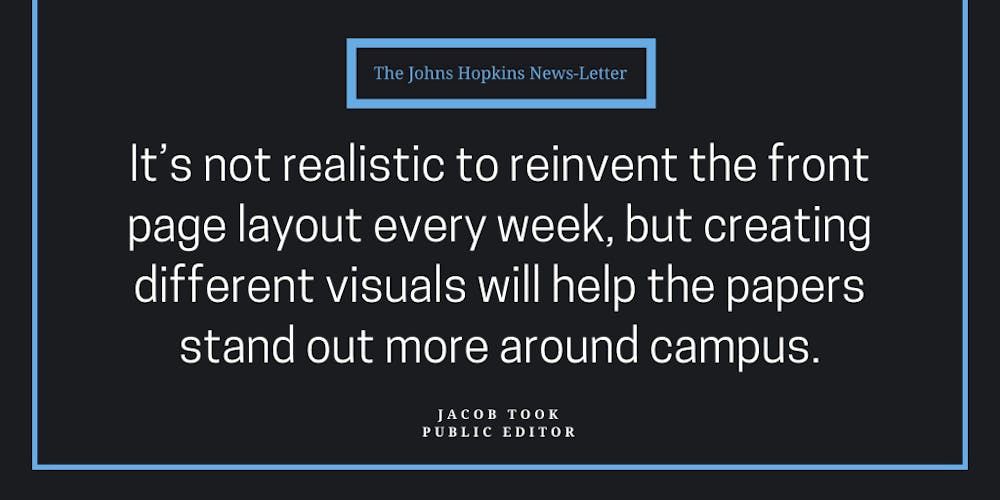
We’ve seen two special A1 layouts this week, with another out this week. That’s already as many as last year. None of them are particularly mind-blowing — just unique orientations of photos, articles and headlines that make the front page more eye-catching. That’s perfect, though. It’s not realistic to reinvent the front page layout every week, but creating different visuals will help the papers stand out more around campus.
In amassing an archive of interesting A1 layouts from which to draw inspiration, Gutierrez said they’d noticed a trend of more modern presentation on newspaper front pages around the country, and are looking into modernizing the look of The News-Letter. That includes experimenting with spacing and fonts, as well as shifting elements around — like the “Inside this Issue” box.
The “Inside this Issue” box lurks in the bottom corner of the front page. It features three articles each week, ideally from sections other than news (although there have been some slip-ups on that point). I say ideally because the box really should be a way to bring more sections onto the front page and show off the full range of content the paper has to offer.
Yes, news coverage is important, and a lot of readers turn to The News-Letter to stay informed on the important stories on campus. But news only takes up seven of each issue’s 24 pages, and those other sections do important work representing Hopkins students. Doing more to bring those voices to the front page can only encourage more passing readers to pick up a print copy.
Gutierrez plans to shift the front page up so that the “Inside this Issue” box becomes a banner across the top. They hope to use an above-the-fold banner to feature content from other sections more prominently.
“It’s basically more interaction with the wider newspaper, rather than just two articles,” they added.
A banner could also give Gutierrez the space to more intentionally curate the selection of content from other sections featured. The “Inside this Issue” box is pretty static, featuring three articles, only one of which gets an accompanying image. A more flexible banner could spotlight just one particularly significant piece like a major sports victory or an opposing viewpoints. Or it could put pieces that touch on the same issue in dialogue with one another.
As Layout Editor, Gutierrez is responsible for catching and directing the reader’s attention through the print issue. They do this through the front page layout, the “Inside this Issue” box and also the layout of B1 — that’s the front page of the B-section, featuring three headlines and a photo each from Arts & Entertainment, Science & Technology and Sports. While A1 may be the most visible piece of this conversation, let’s not forget about the immense potential for flexibility that a space like B1 offers.
Front page changes feel really significant now because A1 has looked so familiar for so long. And for good reason — it’s the most visible part of the paper, so it’s important that the front page looks good and reads well. But the paper does itself a disservice as long as it continues to resist experimentation and variation. If every week has a special layout, that just becomes the new normal — and readers will notice.
Looking ahead, Gutierrez doesn’t plan to turn away from creating more dynamic front page designs anytime soon.
“We’re trying out these new weekly changes to layout, so it’s going to be a development,” they said. “I’ll fine-tune stuff as I go along.”
We want you to be part of this conversation! We encourage our readers to email publiceditor@jhunewsletter.com with questions or comments about our practices and published content.